Graphic Design Halloween Costumes 3

It’s that time of year again when leaves change, the sky gets a crisper blue, the evenings cool down, you pull out your big cozy sweaters and cuddle up with your favorite someone over hot apple cider. Well actually, here in San Francisco, not that many leaves change, and your sweaters are already in heavy rotation after our freezing cold summers… but it still somehow feels undeniably like Fall now.

And that means Halloween is almost here, and the challenge of coming up with a fun graphic-design-related Halloween costume is once again upon us. As I unfortunately will be missing Halloween this year, here are some costume suggestions for all the other designers out there, and I hope you guys do something incredible!

Villains and Horror Shows

X-acto, Chip Kidd’s Batman Nemesis in “Batman: Death by Design”

The famous book cover designer Chip Kidd, who I’ve written about before, has written several books including an issue of Batman titled “Death by Design.” The premise is pretty amazing, with architecture- and construction-related villains wreaking havoc on Gotham City, including the punny “X-acto” named after a designer’s best trimming & cutting friend (read more about the plot). Talk about the perfect design villain costume! This woman’s silver-gloved get-up and fabulous headpiece are great inspiration for a pretty epic DIY costume. (source)

Pixel and Pilcrow - Graphic Design Halloween Costumes - X-Acto


The Death of Print

Whether you think claims of an inevitable “death of print” are baseless fear-mongering or an informed view of a technological revolution, this costume allows for fun, dramatic, nerdy, puny creativity—all my favorite costume characteristics! (source)

Pixel and Pilcrow - Graphic Design Halloween Costumes - Death of Print

Bad Kerning

I wasn’t able to find an example of this costume already done, but I feel like there is a lot of potential here. Whether you’re using bad kerning to make silly click/dick jokes, or just trying to horrify your designer friends, there’s plenty of room for fun. One idea is going with a group where each person is a different letter, and spend the evening playing with ways to be improperly spaced—lots of photo ops!

Internet Related

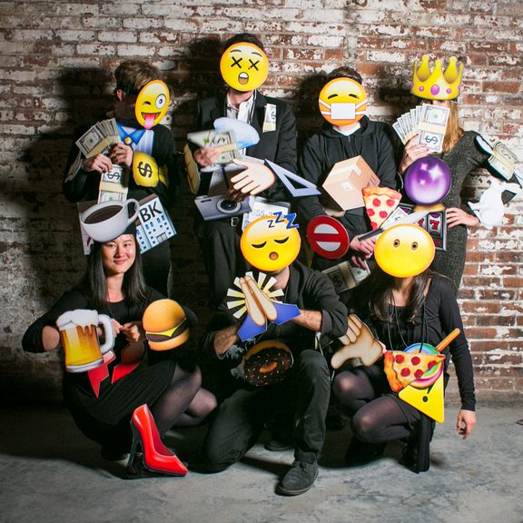
In previous costume post, I featured Internet-themed costumes such as the Firefox Logo and an 8-Bit Avatar. Recently I found a few great additions to this collection—meme, app and emoji inspired costumes. Check out these hilarious black-and-white greeting-card ladies (source), classy app icons, emoji group (source), and beer-drinking smiling pile of poo!

Pixel and Pilcrow - Graphic Design Halloween Costumes - eCardsPixel and Pilcrow - Graphic Design Halloween Costumes - App IconsPixel and Pilcrow - Graphic Design Halloween Costumes - EmojisPixel and Pilcrow - Graphic Design Halloween Costumes - Emojis

Follow Ups from Previous Posts (I and II)

Some great new ideas for a Pixelated costume:

Pixel and Pilcrow - Graphic Design Halloween Costumes - Pixelated 1 Pixel and Pilcrow - Graphic Design Halloween Costumes - Pixelated 2 Pixel and Pilcrow - Graphic Design Halloween Costumes - Pixelated 3

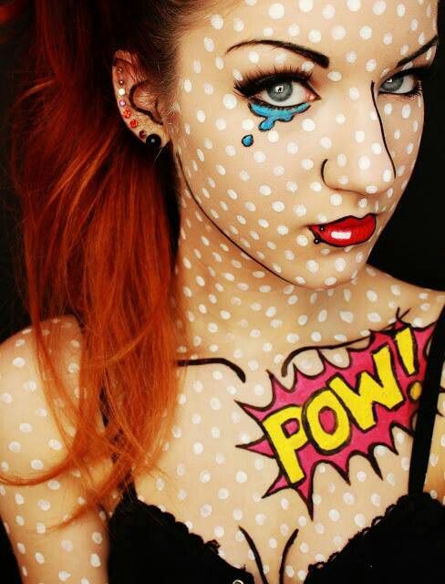
… and new ideas for Famous Artwork, especially the Roy Lichtenstein girl:

Pixel and Pilcrow - Graphic Design Halloween Costumes

Last Minute Costume

My favorite Easy Out costume this year is to get together with some buddies for a CMYK costume. With other group sizes, you could do a 3-person as RGB or a couple as BW. And if you’re the only costume-procrastinator, there’s always my favorite from the last post, Error 404: Costume Not Found.

Pixel and Pilcrow - Graphic Design Halloween Costumes - CMYK

And finally, if you want to bring your design-related Halloween theming to an all time high, try your hand at carving a Pantone Pumpkin!

Pixel and Pilcrow - Graphic Design Halloween Costumes - Pantone PumpkinEnjoy your Halloween!

On My Wall?

On my morning commutes I’ve been continuing to work my way through the Penguin 75 book that I wrote about in my last blog post, and enjoying the creativity and beauty that I’ve come across. In the WoodsI’ve been surprised with how often I’ve been completely surprised with what they’ve done, perhaps especially with their Graphic Classics Series where they created comic book covers for classic literature. But there were two covers in a row that made me pause and think. The first was In the Woods by Tana French, designed by Jen Wang on page 140, followed by The Island at the End of the World by Sam Taylor and designed by Matthew Taylor. They are two very different covers, one a black and white sketch of letterforms turning into branches, and the other a medley of ravens, tigers and butterfly erupting from an anime-looking pair of pants and unlaced sneakers. However I was struck by how similar the two author’s comments on their covers were.

Tana French, who is Irish, said

Covers on the European side of the Atlantic are so different from American ones that, to me, this looked nothing like a book cover. It was a truly beautiful thing. I could have looked at it for hours, and I’d have loved to have it in any one of a dozen forms—as an art print, a wall poster, a T-shirt—but if I’d seen it in isolation, I’d never have guessed what it was. I think I still see it that way: First as a thing I love looking at, and only second as the cover of the book.

I The Island at the End of the Worldcould appreciate that the cover was a little unusual, although I’m curious about how European covers are different. I’ll have to look into that. Turning the page to The Island at the End of the World, I read about how this cover was the result of a design contest. The author Sam Taylor’s comment on the design for his book was

I must admit my first reaction on seeing the winning cover was: WTF? It was gorgeous and striking, but not at all what I expected.

Both authors were struck by the fact that their covers were gorgeous, but not at all what they were expecting. The unexpected aspect was probably chosen deliberately by the art directors, but the gorgeous part, the artistic part, that is what helps makes these book covers some of the best in Penguin’s repertoire.

As I read these responses I was reminded of a moment during the second week of my design class last semester, when we were getting feedback on our first assignment of the class. It was essentially a warm up exercise for the semester; we were supposed to take a poster by a famous designer that we were assigned (in my case Jan Tschichold) and redesign it in various ways using only the compositional elements that were in the original design. We brought in our new posters for feedback, and at one point, after pretty thoroughly criticizing everyone’s designs, our teacher asked me “So, Rebecca, which one would you put up on your wall?”

I was surprised by this question, as we were designing announcements for events and new movies and I was envisioning them on the street or posted on the wall of a movie theater, but definitely not hanging, framed, on my living room wall. It was an interesting, and I quickly realized, a good question. Because frankly, I wouldn’t have put a single one of my own designs up on my wall—they were ugly! And attractiveness isn’t a criteria I’d really been taking into account, but it made me think of the famous Fillmore concert posters that I’ve seen on teenagers’ bedroom walls across the country. Or of the beautiful posters by Otl Aicher for the 1972 Munich Olympics. Or the simple yet elegant advertisements for railways and state parks by Michael Schwab. And I’ve liked them because no matter what their original purpose was, they are interesting, intriguing, pretty, elegant, well designed, and in some way or another gorgeous.

So with this question in my mind, I went back to the drawing board. I kept in mind some of the design feedback I’d been given, and what other students had done that I thought had worked well. And I tried to envision them on my wall; I tried to make them artistic and interesting. In the end, I’m still not sure if I’d put them up on my own wall or not (they don’t really match the mood of my room), but I think my second round of designs was much more successful than those original submissions. And a couple of people I showed them to seemed to seriously consider taking me up on my offer to give the posters to them to hang in their apartments, which to me means success.

It’s fascinating to learn how to design, coming from where I do. Its unusual for me to be studying something that I have absolutely no formal academic experience in, to be stumbling across new and interesting ways of thinking about my discipline all the time. It’s absolutely fresh, not something I’ve been told about and taught for the last twenty years, and I’m really enjoying it. And I’m finding some amazing things to put up on my wall.

(by the way, for a very interesting insight into the process and design for the cover of In the Woods, go to the Faceoutbooks.com blog entry)