Reading on the web can be annoying. Websites are often crowded with additional features, graphics, ads, navigation, alternative content, links, and who knows what all else. Every little thing pulls at your attention, drawing your eyes away from the text you are trying to read.
This is the polar opposite of reading a book. In a book, you get the text, perhaps a page number and chapter title in the corner, and that’s it. Even reading modern ebooks, for example on the kindle, you usually still just get text and some information tucked in at the bottom about how far through the book you are.
So what’s up with the web? Why can’t web designers control their impulse to put anything and everything on the page next to the text? The answer is, they’re starting to, and we can see this in both the NYTimes redesign and Medium, the latest venture of Twitter cofounder Evan Williams.
NYTimes.com Redesign
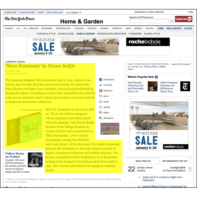
The NYTimes.com previous site design was just as bad as anyone in terms of loading up the page with distracting extras. Below is a screenshot, where I’ve highlighted which part of the screen is actually taken up by the article (including the article’s picture):
Compare that to the new NYTimes.com design, where they’ve recognized how much better of an experience it is when the screen isn’t completely cluttered:
 Because they still need to make money from ad revenue, there is an ad at the top. But notice how I could say “an ad”—there’s just one. And there are still links to share the content online and go to other sections, but they’re kept to strictly defined areas that don’t compete visually with the article. Typographically, the article title now grabs your attention as the most important text on the page, and the social media icons are now all the same color so they’re less visually distracting. And now look at what happens when you start reading the article:


