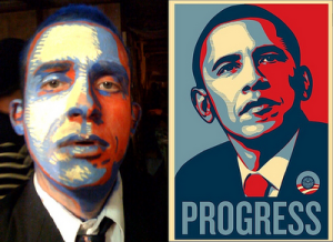
Last summer I downloaded the Instagram app for my iphone, futzed around with it for an afternoon, and decided it wasn’t really that interesting. Plus, I found a different photo app called Camera+, featured on the wonderful typography website www.fontsinuse.com for its use of the beautiful typeface Bree (read their Camera+ post). It seemed pretty cool.
But the other day my boyfriend was griping about how Camera+ and Facebook both make you log into their site to view any pictures, and he put up a fairly good argument for the Instagram app instead. So I decided to try it out again, give it a second chance to impress me.
Aaaand I might be minorly addicted, already. What I either hadn’t noticed, or hadn’t been developed well enough the first time I checked it out, was Instagram’s twitter-like interface for sharing photographs and viewing a group of selected friends’ images. I quickly discovered that quite a few of my art school classmates are on there, taking awesome photographs and sharing them with all. And their photographs were doing what good photographs do—making me look twice at the world around me, making me see the beauty in a basketball court that I wouldn’t have seen the first time I looked. They made me start to look at my world through the photographer’s mental lens again, make me really look at the visual appearance of everything.

Even the filters, which are part of what people love about Instagram, seem to help me develop my aesthetic sense. How does the muted blue-tinged filter make a photo feel as opposed the exact same photograph with the high-contrast filter? How are my classmates manipulating their photographs to add visual impact? Can I get good at identifying the best filter for a photograph in Instagram, in an effort to have more mastery over visual manipulation in general?
Using Instagram again reminded me almost immediately of the feel of my first semester at AAU when one of our assignments was, in addition to regular homework, to bring in 7 new images every week. The point was to get us to start looking, to start identifying good images and learning how to obtain them and make them ourselves. At the time it felt like kind of a pain in the neck to have to do every week, but it really started me looking for good images. And a graphic designer is nothing without good images.
So, in a way I feel like using Instagram is really just an extension of art school. Can I take a picture, make an image, that is beautiful and more importantly, worth sharing? We’ll see.
(Follow me on Instagram! My account name is “rewright”)


 or those who are not yet familiar with the website,
  ome of her style tags include:
 essica Hische has been coming to my attention more and more lately. I’ve been checking in semi-regularly to her new site,


