So much attention is paid to the front of books that it’s easy to forget that the front cover is only a part, and perhaps not even the most important part, of a book cover. The back cover, the spine, and even the front and back cover flaps are important parts of the book cover experience.
I think there is a strong argument to be made that, at least historically, the spine is at least as important as the front cover. After all, books are kept on shelves, and spines are pretty much all you see when a book is sitting next to its fellow books on the shelf. When perusing books in the library or on your own bookshelf, the spine is all the book has to attract your attention and make you pull it out and look at its front cover.
It’s an interesting challenge to design for the spine. It’s often quite a small area and it has to have a lot of information on it, which is usually awkwardly read sideways. And unlike a front cover that is seen while held in your hands, a spine is often viewed from further away, perhaps even across the room, so it should be eye-catching. Yet so often spines are boring, plain, and uninspired. They look like afterthoughts, which I would guess they very often are.
So here is a collection of books with fun spines—specifically, where the cover art has been designed to wrap around from the front. I like this technique because it gives the viewer just a tantalizing peak of a larger piece of artwork, encouraging the reader to pick up the book and satisfy their curiosity about the rest of the design.


However, I have to admit that there are a couple of reasonable counter-arguments to this suggestion that the spine is most important. For example, you could argue that plenty of books are displayed in stacks in a bookstore, so it is the front cover that first attracts your notice when considering what to buy. And plenty of books these days are bought from online retailers like Amazon, where a picture of the front cover is really all the customer sees before they purchase the book.
Perhaps the most interesting counter-argument is the case of ebooks. In most ebook apps, such as the Kindle or iBooks, your library is displayed in some sort of grid and only the front covers can be seen. For those ebooks, the spine and back cover don’t exist anymore. And perhaps, like music, the book industry will continue to evolve in that direction, so that all you see are small thumbnails of cover art on a screen somewhere. I kind of hope not.


I do agree the spine is an important but neglected part of the book. I learned that first hand when designing covers for my own books. Thanks for the reminder.
Yeah, it can be a challenge. What was your spine solution for your book covers?
I think I first noticed spine design when reading a book designed by Chip Kidd (Blood on the Moon by James Elroy), and thinking how arresting the vivid white and red stripes he’d put on the spine were.
Well, I used Createspace to create my spines, so I tried to make them match my cover in some way. So far, I’m pretty satisfied with what I’ve done, though I hope to experiment more in the future with the medium.
What beautiful spines that you have shown. Love your creative use of art! http://www.segmation.wordpress.com
Thanks!
I love thinking about how book cover design can complement, enhance, add intrigue to, or generally play off of the work of the author—another, yet completely different art. Two different disciplines, working in tandem!
Being old-fashioned and loving actual books rather than virtual ones, I agree with your argument. The spine is all u can see on the shelf, so if it isn’t creative it will be buried along with the rest of the books and you will hardly notice it. Especially if the book isn’t a classic or a bestseller, where the title or the author is enough to attract the reader.
I totally agree 🙂
And, I don’t know how you plan for this when you design the book cover, but I always get so sad to see some of my favorite books that I’ve had for nearly forever, with really faded spines and awkward lines where the fading stops on the front cover.
Beautiful choices and presentation, Rebecca!
Thanks Gina! I’m glad you enjoyed the post
Interesting. They’re not just design elements; book spines can carry hidden messages, like this … http://wp.me/p2w3tz-fg
Yeah, it’s fun to read the pithy phrases or poetry people can come up with using book spines! It’s a tricky kind of composition though.
Yes, it’s a demanding medium, in its own small way. I’m trying to come up with the first book-spine advertising haiku for my book, the conveniently five-syllabled The Great Firewall.
I admit to picking many books by its cover/spine !
Living in Spain, I always find it funny that they print the text on the spine ‘upside down’ so that it reads from bottom to top. They do the same in French too so I wonder if we’re the odd ones out in the English-speaking world.
There actually is a reason behind that!
In the US we print them top to bottom because that way, when a book is placed flat on a table and the type becomes horizontal, it can be read correctly.
However, in general when type is set vertically (like on a spine), it is preferable to set it reading from bottom to top, because the upward direction is more of a positive reading experience, rather than drawing your eye into the ground.
Many European countries use this bottom-to-top convention for book spines, mostly out of tradition at this point.
The two different markets, US and Europe, have settled on opposite practices for book spines. If you want to read a bunch of people scratching their heads on what to do about it, and what’s best practice, check out this long back-and-forth forum discussion: http://typophile.com/node/970
Odd. There is one book out of about 1,500 on my sheves with the title this way: The Matter of Zen, by Paul Wienpahl, published by Allen and Unwin in 1965. It sticks out like a sore thumb. Could it be intended to jolt the mind into wakefulness by confronting it with the unexpected? Or was it a cock-up by the printer?
We’ll have to meditate on that one!
I think it’s a good idea to have the cover art wrap around the spine.. it looks cool!
It’s hard to get the spine right when you’re self publishing. I wish I could do a better job on the spines of my books but I regrettably can’t.
It can be hard to get them to come out the way you want when using the tools available to you as a self-publisher. I’ve helped my father design covers for his books, Dr. Wright’s Kitchen Table Math, using Amazon’s CreateSpace tools, and I feel your pain! The spine is such a small, precise space, and the printing techniques rarely seem to have the accuracy to get the design just right in that space.
That is actually one of the advantage to wrapping the design across the spine from the front or back cover—you don’t need as much precision.
Also, if you think your spines aren’t coming out well because you feel uninspired or don’t have any good ideas, I highly recommend going to a bookstore or library and checking out what techniques other designers have used to find something you like. It’s the age-old adage, “Steal like an artist!” 😀
There aren’t very many options and sometimes the book is printed slightly off as well, misplacing the text on the spine.
Thank you for bringing attention to the often-overlooked spine. I myself select many books based on the spine, so it is important that it grab my attention.
Always happy to help the cause of great book design! Thanks for reading.
Are there any books you’ve seen that do an especially good job with the spine?
I’ve never really though of it before, but your right, the spine is often neglected. Some great examples you give, those covers and spines are brilliant! Really when you think of it, the spin is more important, its the first thing we see as we browse the shelf in a book store. Anything that makes its stand out must be good.
I agree! The trick is to make design (in this case book spines) stand out in ways that are beautiful and intriguing, rather than gawdy or ridiculous. It’s a fine art to get people’s attention without hitting them over the head!
I agree, those designs were beautiful, especially how they made the spine an integral part of the cover itself.
When the spine of a book is split, or bent too far back, it makes me cry a little inside.
I have to admit, I’m of two minds on that.
On the one hand, as a book designer who has painstakingly sewn the spine of a hardcover book together one signature at a time, I believe books should be treasured and handled with the utmost care.
On the other hand, as an avid reader who loves to have a book with me at all times, some of my favorite books are almost disintegrating due to the number of times I’ve read them and the places I’ve dragged them. So to me as a reader, that wear and tear is almost like proof of how beloved they are.
I’d much rather my books be used, and read, and show evidence of that, than sit on a shelf somewhere and never get picked up because they are too precious.
But a truly broken book is a tragic thing…
I must admit I love books too and when the spine is visibly broken i just don’t like it. I love my books and that’s why i hate seeing the spine being broken or damaged, it might just be me.
I love hardback books or special editions of books, there’s just something about them that’s special (the only downside being that they take up a ridiculous amount of bookshelf space)
An ignored book is even more tragic, i have about 15 sitting waiting to be read and i just haven’t found the time to read them.
Ignored books make me think of a forlorn puppy giving you a guilt-trip-inducing look.
I, too, have a huge stack of books waiting for when I have a free moment—between working and finishing up my thesis, I rarely have free time to spend with my books! I’m dreaming of this summer, when my thesis project will be finished 🙂
They are that and yet i keep adding to that pile by buying more!
I’m really just reading books for university (not of my own choice) but they’re not too bad so far. If not of my taste.
Yeah, I ran into that too (I majored in Literature in undergrad). But I’ve found in retrospect that some of the books I wasn’t so interested in or that weren’t my style have stuck with me the longest because they are so unlike anything else I’ve read, and kind of captured my imagination in ways I didn’t expect.
Plus, you have your whole life to read books YOU pick out—it can be fun to have someone else pick them out, even if you have to deal with less interesting works 🙂
These are truly beautiful designs. Amazing!
I totally agree! I love books and their spines totally connect to the covers making them even better!
I agree. However convenient an e-book might be, there is no ‘feel’ that one gets on ‘seeing’ the book that one derives on seeing a physical book. Great write up.
Thanks! I love beautiful books, but I have to admit, I do read ebooks too—I think they each do different things well.
I prefer to get detective books and lighter travel reading on my kindle, so I can read it on trips or on transit on the subway more easily, but I still love and buy and treasure beautifully designed paperbacks and hardcovers.
Surely, you’ve heard of the inventive way kids are rearranging the spines of World Books in libraries to spell…well…something else.
The anarchistic artist in me in so proud while the writer in me…okay, the writer is just jealous I didn’t think of it in the 80s.
wow interesting! I never really thought about it before but I think you may be right. Congrats on getting on Freshly Pressed! 😀
Thanks! Glad you enjoyed the post.
Your welcome. 🙂
Its for the pleasure of these beautiful designs that my first loyalty will always be towards real books rather than virtual ones. Long live paper and beautiful designers.
Oh good, I’m not the only person who picks up books in bookstores just to marvel at all of the cover design 🙂 I love the examples you show here! Thanks!
Thanks for reading! You are definitely not alone in your appreciation of covers… As both a designer and reader, I frequently have to (somewhat embarrassingly) admit to myself that a major part of the reason I buy a book is for the cover!
I mostly read physical books and mostly get these books from either the library or physical bookstores. In the bookstore, only the most popular books are displayed face-up; for the rest, only the book spines are visible. As such, I agree with your point that the book spine is very important because it is the first point of contact between the reader and the book. I definitely appreciate a good book spine that complements with the book cover and the flaps etc.
Your choice is very nice and beautiful… 🙂
Thanks! Really, it’s for almost selfish reasons that I write this blog—I love having an excuse to discover and enjoy beautiful books
Welcome and Keep the post. .. 🙂
My young sister is a book lover and her bedroom walls are covered in bookshelves. She decided to order her books by the colour of their spine. I lamented, telling her what a ridiculous notion that was as how was she ever going to find any books? So I tested her, calling out the name of the book and author and she would tell me what colour and design the spine was. We did this about 15 times and she got every single one right. Now that is somebody who appreciates a book.
Wow, that is impressive! She also must have a great visual memory.
I have always identified casual things, like my shampoo, by their appearance rather than their name, but it took me awhile to figure out that I should be in a visually-oriented profession 🙂
That’s so interesting, I’ll be sure to mention that to her 🙂
Reblogged this on Quelle Surprise. and commented:
Nice!
Never thought of the spine but it supports the book and the body so it is important. Thanks for bring it up. It is important for it holds the pages together.
I’d never given this any thought before, but you’re absolutely right! Most of the books on my shelf have colourful and interesting spines, so in a subconscious way I must have noticed this when choosing them! Thanks 🙂
Reblogged this on Books Are My Thing and commented:
What a great follow up to my post about book covers. I agree, the spine can often grab our attention or create disinterest in the same way as a cover can. I personally tend to shy away from books whose spines contain hard to read text; for some reason that equates to me enjoying less the way the book is written. I also love when a series of book spines come together to make a complete picture, such as Chip Kidd shows in his TED talk, or when they all match up nicely. I too fear what the future world will look like when most books truly become digital – will there be less imagination in the world?
I must agree, I really enjoy when book spines come together to make a complete picture.
I’ve seen this before for book covers (there’s an amazing series of Oliver Sacks covers I wrote about in “A Cover Collection”) but because you don’t usually see book covers spread out like that, you can’t appreciate as much as when the connected design is on the spine, where you will always see them all together.
For as often as I cringe at a boring cover, I’m surprised I never appreciated how a book’s spine is presented until now. Like you said, it’s what you see when it’s sitting on the shelf, so it SHOULD stand out. Great post. 🙂
Thanks! I enjoy having books around (I’ve got a bookshelf in every room!) so I really appreciate beautiful covers. But except for the one that’s perpetually on my bedside table, all I ever see are their spines. It’s amazing what a difference an interesting spine can make.
Agreed. Come to think of it, when I’m browsing in the library or bookstore, I usually check out the books that have spines with cool designs or fonts. Still surprised I haven’t picked up on how influential spines can be until now. 🙂
What a lovely post! It’s not often that something like this gets freshly pressed, so I found this refreshing. Cheers!
I’m glad you enjoyed it! Thanks for reading
Thank you for this – I love books and the beautifully ones are such a joy. Though now everything is digital not many people buy books or do they?
I think you’d be surprise by how many people still buy books. There are a lot of people out there who buy both ebooks and traditional books (myself included).
Too many people love books for them to die out anytime soon, but I do think that more and more people will be tempted to buy beautiful hard-cover or special edition books, and the cheap paperback market will lose more business to ebook sales instead.
Have you heard of Persephone books? They are inexpensive, but well designed…
Reblogged this on SPARK! Creative Artspace.
Great write. Before publishing, I actually went to book stores to think about covers and noticed how the spines stood out. I focused more on the actual cover and the spine did become an after thought. I was more concerned with the front and back not on purpose.
I will definitely give it equal focus on the next book, because you can’t tell a book by it’s cover but it is the first thing that attracts us.
Also, the back of the book is disappearing in the digital world. It no longer exists in ebook form, at least I haven’t seen it.
This is really interesting. I never thought about the spine before! I’m always just focused on not creasing it (: thanks for sharing
Thanks for reading! Glad you enjoyed it
Reblogged this on come have sex everyday.
Reblogged this on untypickal and commented:
I agree in hoping that bookshelves aren’t steadily making their way to becoming like iTunes libraries with thumbnails and tiny print on small screens. I am guilty of having a sizable digital library, but I have physical copies.
I was just thinking about book spines too. I wondered why it is that its easier to read a book spine in a downward motion, than it is to read it in an upward motion. Not that its terribly hard, but it is a bit more awkward. I wonder if its different for left handed people?
Hmmmmmm..
I was actually discussing text direction on spines in an earlier comment with Alastair Savage. If you want to read a lengthy discussion of a lot of different confused people speculating on which direction is better, check out this post on typophile: http://typophile.com/node/970
Thanks! I thought I was insane for thinking about this for as long as I did haha
Ah, thank you a really interesting post, something I’ve never considered – and no doubt I will now NOTICE spines! And that is what art (in any form) always does, or, I would say, needs to do – to make us wake up, notice and be present in the world, and perhaps see something which has always been there, but we never registered before.
You have no idea how having my attention focused somewhere it has not consciously been before, is a pleasure!
BTW one of the BIG problems with the Kindle, useful as it is, is that most of the time the way a really good book cover can enhance and deepen the reading experience, is completely lost. You see the cover if you are bothered to go back to the very very first page, and then never again (at least not on the older Kindles) as turn on and you go to the last page read. You actually have to make an effort to find the cover, as even on download and first open, you don’t see the cover, or the back, or the spine.
I ended up getting one particular real book, Ken Kalfus Equilateral, as opposed to the Kindle version BECAUSE the original cover in the UK (I think there are now 2 versions) was a thing of such profound beauty, which enhanced, allured, and illustrated the fine subtlety of Kalfus’ writing in the most extraordinary way. I read the book with the image permanently in my mind’s eye (plus being able to see it again and again)
I shall never ignore a spine again!
I have to agree—when I want to read a book with a beautiful cover, I can’t buy just the Kindle version. I treasure and enjoy book covers too much for that.
And I do find it very intriguing how the art of the book cover can enhance or interact with the art of the literature the author has written… I’m hoping to write a blogpost on that soon! Glad I’m not the only one who finds it interesting.
Great blog post. We spent many hours in bookshops looking at spines when gathering ideas for the design of our debut novel, ‘Eight of Cups’. The spine is a great attractor (or not) for the bookshop browser. Long live hard and paperbacks!
Reblogged this on cupofkt.
I love spines with part of an image on them that are a part of a series of books. When the books are put together in order, the spine creates a horizontal image. It’s an amazing visual on my bookshelf.
It’s true that the spine is an intergral part of its overall allure. Outward presentation is just as important as what’s written on the back of the book/inside flaps. I’ll admit that I’ve most likely overlooked many classic reads solely because it wasn’t eye-catching enough on the shelf, where all I saw was the spine. Although there have been some pretty disappointing reads I’ve picked up that had pretty covers. I love how creative people are getting with the presentation of their books, it allows them to appeal to a certain audience just as the decor of a restaurant would attract certain customers.
Reblogged this on Steve Fentriss and commented:
After seeing the beautiful book covers in this post, it did make me feel a bit sad that digital media pushes us so strongly towards simple visual tiles rather than 3D representations of book covers. On the other hand, there’s never been a better time to judge books by factors other than their covers. Perhaps customer reviews are the new spines and that’s just the way it is.
That’s a really interesting way of thinking about it, that hadn’t occurred to me before. And you’re right, new digital ways of shopping for books have provided us with several important new features, perhaps most of important of which is customer reviews.
I’m not sure I’d draw a direct parallel between book spines and customer reviews, since cover design and books spines in particular play more of a role in discoverability and attracting a customer to pick up a book. Perhaps a better metaphor would be that recommendation engines or Goodreads book reviews are the new spines.
In any case, a lot of good has come with digital shopping and digital reading, and a lot of new things are possible that were never available before. However I just hope that great book design doesn’t get sacrificed in the process!
These examples are stunning. As an avid reader (and book hoarder), I love book spines that don’t feel like afterthoughts. I like spines that are beautiful and distinctive without being gaudy. If they complement the cover, that is even better. Also, I think it is especially important that the spines of books in a series look like they belong together.
I agree! It sounds like you’ve given a lot of thought to spines, glad to find another person who cares about their design 🙂
Very interesting. i hate to admit that i’d never really considered this before but its so true. Another reason to write long books i guess!
I completely agree with this post! In traditional books the spine to me is the most important! Other than the title and art work on spine, the book wouldn’t function properly without the spine! Great post and lots of deep thought!
It’s worth designing covers for epic tomes just for the extra real estate. I usually design spines for very thin books. It’s tricky to get enough space for something great.
Reblogged this on Write Here Write Now.
Reblogged this on wanderwonderingmind.
And I thought I was the only one who paid attention to the spines! Not just the printing, but the shape (flat, curved) and the impact of materials. Some books give me a challenge…get rid of an ugly paper cover and go with the cloth material and design? Or keep the paper cover because I should?
Nicely done
Once you start paying that much attention to the design and the materials, you also get into how the book is bound—whether glued or stitched, what endsheets they use, and the beautiful extra details like ribbon bookmarks or colored headbands at the top of the bookblock along the spine…
When you really savor the art of bookbinding, there are so many fun details to consider! If only it weren’t such a time-consuming / expensive process, I’d do it for everything I design 🙂
Reblogged this on Ulander Arroway and commented:
I saw this post about the spines off books and thought that it was interesting.
Reblogged this on Even Deities Evolve and commented:
Just a little reminder…
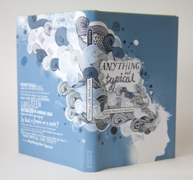
Great post! For me the spines are crucial because I arrange my bookshelves according to their colors and patterns. And actually I dislike the spines that are too bold and bright, because they distract me too much. I love “House of Leaves” spine you presented for its minimalism. “Anything but Typical” design is so beautiful that it makes me want to read this book immediately. 🙂
I’m impressed that you arrange your bookshelves by color and pattern—I find it impossible to find anything if I don’t have it organized by author (or by topic, for my design books and cookbooks).
Bold spines do stand out, it’s true, but I must admit I like the variation they provide.
I’m a custom-made, hand sewn bookmaker. The Spine is important, and I love the examples you have here, and the thought of a book cover, where the front, spine, back, and front & back flaps can convey important information, set a mood, create expectations, etc.
Reblogged this on mintvalf.
Reblogged this on Rupali's Notebook and commented:
Excellent case made for the importance of design for book spines.
Reblogged this on Minerva and commented:
I always though some book spine’s were just amazing!
You’re surely right, spine should have more attention. I love bookcovers and I find walking in libraries a great inspiration. …Very nice book design selection there!